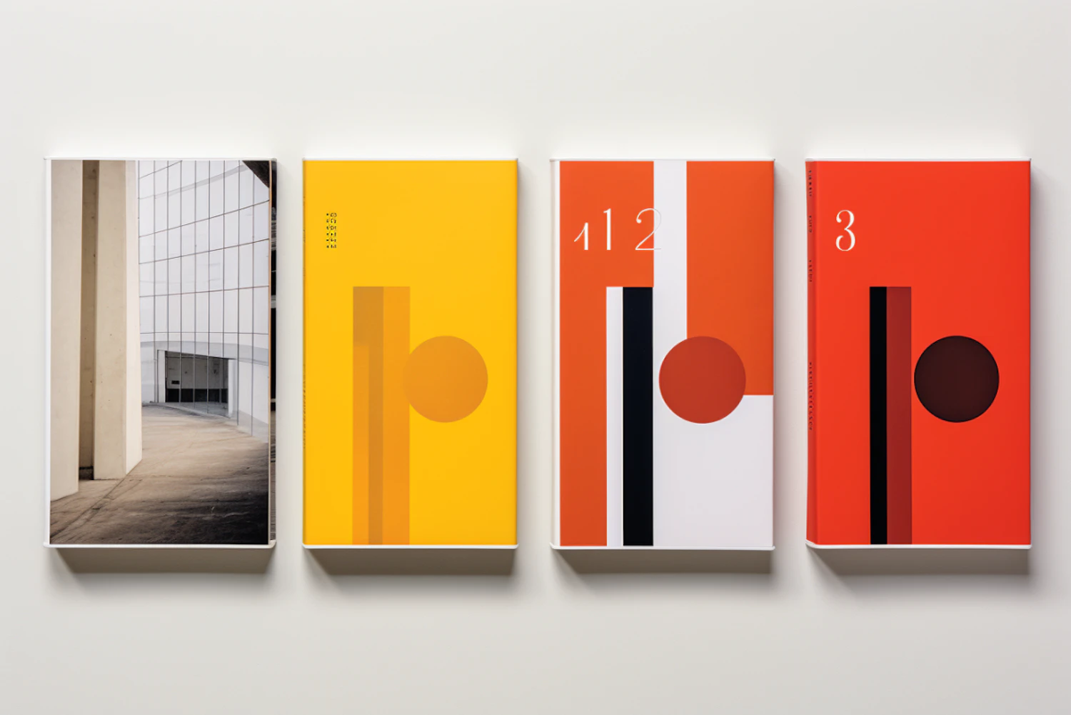
Architectural and Abstract B Series
The image displays a set of four books with varying designs aligned side by side against a white background. The book on the far left features a realistic photograph of an architectural structure, showcasing a corridor with reflective glass walls. The next three books possess bold abstract designs with a strong graphical element, primarily using bright, flat colors such as yellow, orange, red, white, and black. Each cover has a large lowercase "b," executed in a stylistic manner, integrated with either geometric shapes or numbers. For instance, the second book from the left uses the "b" as part of "112," while the other two covers abstract the "b" with circles and lines. The prominent use of the letter "b" suggests these books could be part of a series or collection, and while the first book stands out with its photographic cover, the remaining three embrace a modernist approach to design with their minimalistic yet striking color blocks and shapes. The transition from the photographic to the abstract design could indicate a thematic or narrative progression within the series, or perhaps a visual play connecting the content of the books with their covers. The simple, clean arrangement of the books emphasizes their graphic qualities and may appeal to those interested in design and typography.
Views
Downloads
Collected