Decay and Design: The Yellow 23
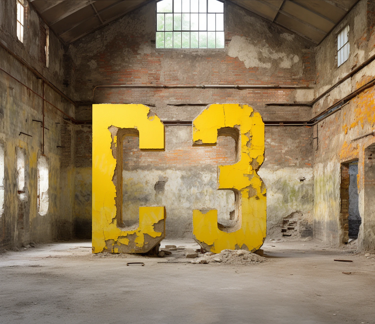
The image depicts a large, dilapidated industrial or warehouse interior with two oversized, bright yellow numeric characters placed at the center. The numbers, a "2" and a "3", are styled with a bold font and have a textured, somewhat decayed appearance that echoes the surrounding environment. They stand strikingly against the worn backdrop, which consists of distressed walls showing exposed brickwork and peeling paint, and a grimy concrete floor littered with debris. The industrial space has windows near the ceiling, partially illuminating the scene with natural light and highlighting the textural variance of the walls and floor. Despite the building's state of disrepair, there's a sense of deliberateness to the placement of the numbers, suggesting a possible artistic or conceptual purpose behind this arrangement. The contrast between the vibrant yellow of the numbers and the muted, earthy tones of the interior creates a visual focal point that draws the viewer's attention immediately. There are no human subjects present in the image; the composition is entirely focused on the interplay between the boldness of the numbers and the decay of the setting, likely invoking themes of time, neglect, or the remnants of industry.
Views
Downloads
Collected